Back to Projects

Fifth Third Commercial Banking

A commercial banking web application redesign for Fifth Third Bank's business clients.

Role

Senior UX Designer

Category

Enterprise Web App Redesign

Clients

Fifth Third Bank

Fifth Third Direct is the commercial banking web application for Fifth Third Bank's business clients, a wide range of commercial customers from small business owners managing day-to-day finances to corporate treasury teams navigating complex multi-account structures.


The application had grown through years of feature accumulation driven by technical feasibility and client requests, without consistent UX oversight. By the time the redesign was initiated, customer complaints had escalated to leadership. The product worked, but it didn't work well for the people using it every day. That gap is where this project started.

The Problem

Fifth Third Direct had accumulated years of feature growth without a corresponding investment in usability. The application could do a lot, but for business clients managing complex account structures, day-to-day tasks were harder than they should have been. Entitlements was the loudest problem. Managing access rights across employees, accounts, and product features was a core administrative task for commercial banking clients, and one of the most common reasons they called customer support. A function that should have been self-serviceable was instead a source of ongoing friction and escalation. Making it harder to solve: the UX team had no direct access to commercial banking clients. A history of difficult experiences with internal departments speaking directly to customers had led the bank to restrict that access. We'd have to understand the problem through other means.

Research & Discovery

Without access to commercial banking clients directly, we built our understanding from the inside out. The most valuable resource we had was Fifth Third Direct's own customer service team, the people fielding calls from commercial clients every day, navigating the application's edge cases, and absorbing the friction that users couldn't resolve on their own. We shadowed CS representatives at their workstations. Multi-screen setups, live customer calls, backend systems running alongside Fifth Third Direct in real time. Watching a CS rep triangulate between three applications to resolve what should have been a straightforward entitlements question told us more about the product's gaps than any survey could have. From there the research broadened. Cross-functional workshops brought together UX, product, development, and business stakeholders to align on priorities and surface institutional knowledge. Persona development grounded design decisions in real behavioral patterns. Story mapping helped the team visualize the end-to-end experience and identify where the biggest gaps lived. The research phase wasn't a formality. It was the foundation everything else was built on.

Preference Testing

With a backlog of research learnings and a long list of potential improvements, we needed a way to prioritize. We identified nine distinct feature concepts and brought them to our most valuable proxy users, the customer service agents on the front lines of every usability failure in the product. The nine concepts ranged from foundational fixes to forward-looking ideas: an Entitlements page redesign, Business Unit Data Visualization, Copy Existing User Access, a Universal Access toggle, Wizards on Core Flows, Proactive Contextual Help, a Next Steps Wizard, Entitlements Light Preset Settings, and a Tool Tip Audit. Each concept was printed with a description and example mockup. We walked agents through them one at a time, ensuring they understood what was being proposed before asking for feedback. They scored each on a 1-5 scale for efficiency and ease of use, then made forced choices: two concepts in a "Definitely Pursue" pile, two in a "Definitely Don't Pursue" pile. The conversation running alongside the scoring was as valuable as the numbers themselves. The sessions surfaced something the data alone couldn't have: the emotional weight behind certain pain points. When we presented the self-service entitlements concept to one CS representative, his response stopped the room.

"This one is big for us… we can't even help them with this right now, we have to get the Implementations Team involved, which can take days… so if they could self service like this? Huge."

"This one is big for us… we can't even help them with this right now, we have to get the Implementations Team involved, which can take days… so if they could self service like this? Huge."

"This one is big for us… we can't even help them with this right now, we have to get the Implementations Team involved, which can take days… so if they could self service like this? Huge."

— Markus, Commercial Customer Support Specialist

— Markus, Commercial Customer Support Specialist

The Redesign

The existing dashboard had a problem that wasn't immediately obvious. Two of its most prominent sections, News For You and New Features and Functions, were effectively internal marketing. New feature announcements, upcoming changes, proactive support notices. Useful in small doses, but occupying prime real estate on a page that business clients opened every day to get work done. They were there, in part, because there wasn't enough other content to fill the space. The redesign set out to prove that wasn't true. Research had surfaced a significant backlog of genuinely useful content that users wanted on their homepage: account data visualizations, consolidated alerts, a message center that could serve as a single home for notifications scattered across the application, quick access to the most common tasks. The new dashboard didn't just look different. It demonstrated that the application had more to offer its users than anyone had organized for them yet. The visual design received a full cosmetic refresh, the first in years. Cleaner hierarchy, better data visualization, a personalized header that oriented users immediately on login. And threading through all of it: customizability. User research had consistently surfaced the request. Different commercial banking clients have fundamentally different workflows, and a one-size dashboard served none of them optimally. The redesign introduced widget-level configurability, letting users organize, hide, or remove modules to suit their own needs.

The Full Process

The work behind the work.

Cross-Function Collaborative Workshops

Story Mapping

Design System Audits

Information (re)Architecture

User Persona Development

Design Thinking LUMA Exercises

Cross-Function Collaborative Workshops

Story Mapping

Design System Audits

Information (re)Architecture

User Persona Development

Design Thinking LUMA Exercises

Cross-Function Collaborative Workshops

Story Mapping

Design System Audits

Information (re)Architecture

User Persona Development

Design Thinking LUMA Exercises

Outcomes

Enterprise UX rarely moves fast. The organizational constraints on this project were real: no direct access to end users, a complex stakeholder environment, and a product with years of accumulated technical debt. The research process had to work around all of it.


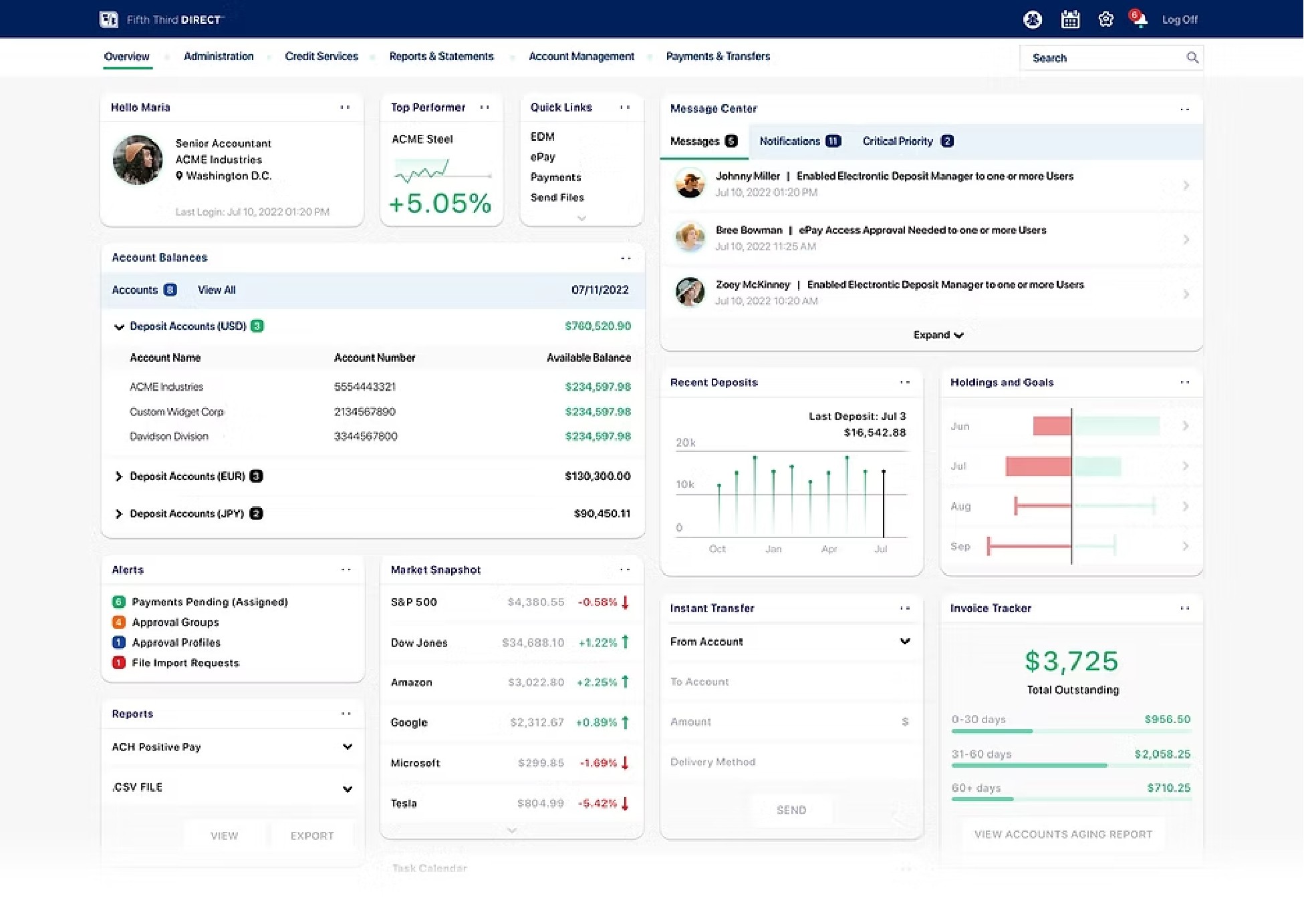
What it produced was a clear, evidence-backed picture of where the product was failing its users and what it would take to fix it. From that foundation, a significant portion of the proposed work made it into production: customizable homepage shortcuts, a front-end visual refresh, Copy Existing User Entitlements, a Universal Access toggle, a Rights and Services page redesign, contextual help modules in key problem areas, and an enhanced Message Center.


The features that shipped weren't the easiest ones. They were the ones the research said mattered most. That's the outcome worth measuring.