First Things First…
Check out this Room Planner sizzle reel, to get a quick sense of the product.
Chapter 1 — The Merge
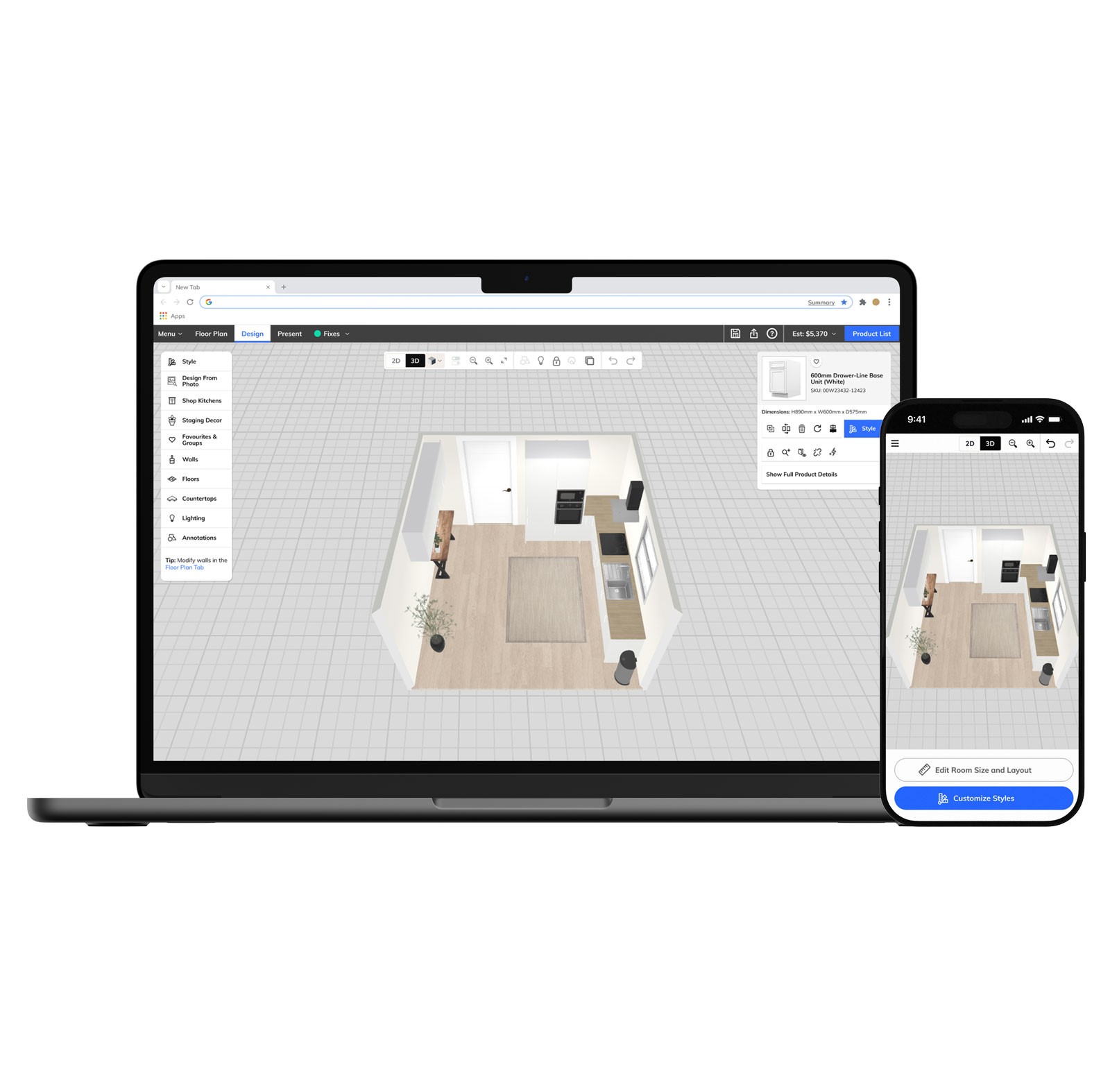
When I joined, RoomPlanner existed as two distinct modes stitched together by a single button. Blueprint Mode was a 2D top-down floor plan tool. Design Mode was a 3D environment where products were placed, styled, and purchased. Switching between them meant a complete visual and contextual reset — different canvas, different navigation, different mental model.
The unifying principle was straightforward: keep the 3D room persistent across both modes. Blueprint Mode and Design Mode became Floor Plan and Design — persistent tabs in a top navigation bar, always visible regardless of where you were in the experience. Switching modes no longer felt like leaving — it felt like changing tools.
Because RoomPlanner is a whitelabel platform, every structural decision had to be brand-agnostic by default and brand-expressive through theming — working as fluently in B&Q's color system as it did in Howdens'.
Chapter 2 — Decking
Decking was the first major feature built on the unified platform — and deliberately the hardest one.
Lowe's and Home Depot both wanted outdoor planning capability. Internally, we saw it as a proof of concept: if the new architecture could handle decking, it could handle anything. Every other RoomPlanner application lived on a single floor plane. Decking introduced elevation changes, multi-level structures, and stair logic that didn't exist in our other applications.
The core design challenge was merging drawing, editing, and spatial decision-making into a single unified experience — one where users could freely move between layout thinking and design thinking without hitting a mode wall.
The stair system was where that challenge was sharpest. Riser count, tread depth, the relationship between deck height and stair run — all of it had to be configurable by a consumer with no architectural knowledge, without surfacing the underlying complexity.
It held up. Client reception from Lowe's and Home Depot was strong. SUS score: 4.8 / 5.
Chapter 3 — Ceilings
Ceilings started as a single client request. Once built, it rolled out across the platform.
The challenge was that users had never had to think about the ceiling before. It was always implicit — a byproduct of wall height. Making it an active design surface meant introducing a mental model that didn't exist anywhere else in the product: extruding a plane from the top edge of a wall and transforming it from there.
The design challenge was finding the right balance between accessibility and power. An MVP ceiling tool is easy to learn but limiting. A fully customizable one handles complex multi-plane scenarios — vaulted sections, angled drops, intersecting geometries — but only if users can understand how individual planes relate to each other holistically. The solution had to do both: give users just enough individual control over each plane, while handling the hard part — calculating seams along collisions between planes — automatically.
The placement of Ceilings within the navigation was a contested decision. My recommendation — supported by an IA card sort and tree test run by our UX researcher — was to house it in the left nav alongside other contextual tools. It shipped as a top-level tab instead, a call made above the design team. The research that followed validated the original recommendation, and a navigation correction is in progress.
Chapter 4 — Mobile
The desktop RoomPlanner experience was built for someone who sits down with intention — opens a browser, starts a project, spends time. Mobile is a different consumer entirely. They're in a store, or on a couch, or killing ten minutes. The interaction model that works for one doesn't work for the other, and a scaled-down version of the desktop wasn't going to cut it.
The core thesis was making constrained feel user-driven. Mobile planning tools have hard limits: smaller screens, touch interactions, backend constraints on what can be configured in a lightweight session. The design response wasn't to expose those limits — it was to sequence around them. Choices were reordered to front-load the decisions users care most about. Progressive disclosure kept the interface from feeling overwhelming. The flow was engineered to feel like flexibility even where the system was tightly bound.
I designed the end-to-end mobile consumer journey in Figma — room shape selection, kitchen configuration, product styling, asynchronous collaboration tools. I prototyped. We tested and validated with end users.